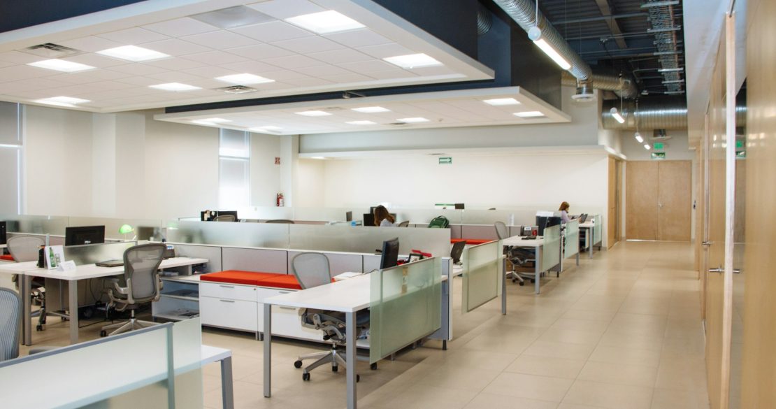
One of the best parts in any design process, whether residential or commercial, is personalizing each space to your taste. This will include things like materials used – glass, wood, brick, and stone, to exact items like kitchen faucets for the break room kitchen, entry doors, office doors, or the kind of flooring needed or wanted for each space. Many people leave interior design for the last step, but it is a good idea to keep it in mind from the start. These basics, along with your company branding – including logos and colors – make a significant impact on workplace design, as well as how employees and clients feel and perform within the space.
Table of Contents
What is Color Psychology?
Beyond Paint
Deciding on Your Color Scheme
Popular Colors to Include and What They Can Do for Your Workplace
Red
Orange
Yellow
Green
A Note About Green & Biophilic Design
Blue
Purple
Pink
Brown
Black
Gray
White
Natural & Artificial Light
Final Thoughts
What is Color Psychology?
There’s a reason your favorite color is purple, blue, pink, yellow, or any other color. Color psychology is a theory of how individual colors affect cognitive function, creativity, mood, productivity, and more. For example, greens and blues are calming hues that evoke relaxation and peace. On the other side of the spectrum, the vibrant tones of orange, red, and others evoke feelings of energy and passion. Neutrals like gray and white provide a sense of serenity.
As with the general study of psychology, color psychology is based on the scientific effect of something, particularly color and its rainbow of hues, on the human brain. Studies have shown that although the effects of colors may seem similar, individual people have unique responses to ‘standard’ color schemes.
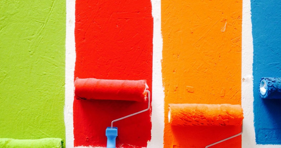
Beyond Paint
Color psychology relates to more than the just the paint color on the walls of your office space. It extends to the colors of materials like counters, cabinets, and floors, as well as accessories like pillows, bedding, and even the color of the end table lamp and its shade. While not all of these things are found in an office environment, the color of any accessory – like office chairs, décor, and more set the tone for the space and evoke various emotions and reactions.
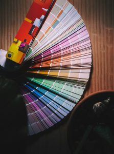
Deciding on Your Color Scheme
You may think this is a no-brainer: the colors of your company logo and branding. Take a step back and look at the bigger picture. Realty Asset Advisors’ brand colors are gray, red, and white. We could build an office design around these three colors alone and their many shades, but adding pops of different colors that complement this color palette with make for a much more eye-pleasing, interesting design and environment in which to work.
Think of the many ways you can incorporate color into the workplace. Paint, task chairs in colors other than black or white, other furnishings, the color of carpet or other flooring, counters and cabinets in the kitchenette/break room, and more. If you have an open collaboration area, consider comfortable seating like floor cushions, bean bag chairs, or couches in vibrant colors.
Popular Colors to Include and What They Can Do for Your Workplace
You learned about the primary colors of red, blue, and yellow in kindergarten. Then came secondary colors, or the colors that are created from the combination of these three primary colors – orange, green, and purple. Pair these and their various shades with neutrals like black, gray, or white, and the color palette of your workplace will come alive.
Red
This primary color evokes many different feelings in people and should be used cautiously in the workplace Positive emotions evoked by the color red include energy, vigor, strength, courage, and leadership – all traits you want to see in your employees during a workday. Other positive feelings, such as joy, love, passion, desire, sexuality, and sensitivity can be ignited by the color red (although you may not want to start office romances due to too much red around!).
On the other hand, there’s a reason the sentiment “seeing red” is negative. Red can also be associated with anger, rage, malice, wrath, and even danger and war. These negative emotions need to be balanced with neutrals like white and beige that offer a calming effect. You don’t want angry or otherwise upset employees, hindered from doing their job because of a color choice.
Orange
The vibrancy of the color bring with it a plethora of emotions with its reflection of sunshine and nature. Happiness, calm, joy, relaxation, and warmth are all positive emotions that will make the workplace a better environment. Creativity, fascination, adventure, healing, and energy are some necessities for any job or task. These and others are the many positive feels associated with orange. Love, attraction, passion, sexuality, pleasure, desire, attachment – while positive emotions, can distract from the job at hand. But orange has a negative side, too. Deceit, betrayal, aggression, dominance, and distrust are some of the less affirming feelings associated with the color, and can drive a wedge between colleagues and cause more dysfunction than collaboration. Other colors along the orange spectrum, like gold, represent wealth and prosperity – making it an easy color choice for the office.
Orange and its stimulating effect on the appetite make it a great color for the office break room or kitchenette space. Wherever you use it, mix it in as the “pop of color” against other neutrals for the highest impact.
Yellow
Like orange, yellow is synonymous with sunshine and the light and happiness it brings. Emotions it often evokes include care, happiness, joy, and obedience. Positive traits of yellow you’ll want in your workplace include intelligence, productivity, cordiality, energy, freshness, and nature. However, heed this word of warning: yellow also brings on feelings of jealousy, doom, decay, sickness, and caution – emotions you don’t want running rampant in the workplace.
Consider yellow for the kitchen, dining space, or smaller spaces like hallways or bathrooms. The positive emotions of the color will help uplift spirits and add brightness to a room. Additionally, to keep the mood happy and bright, use brighter shades. Dull and dark shades evoke the negative emotions associated with the color, stimulating uncontrollable emotions, driving up blood pressure, and stimulating temper without provocation. If using yellow is necessary (like for company branding), pair it with neutrals to balance it out.
Green
People see green and often think of nature. This translates into the human psyche as freshness, peace, and trust, and makes green a powerful color in any interior design. Various shades of green are associated with food and the comfort it brings. Green relaxes the senses and, in the exact opposition to yellow, lowers hypertension and blood pressure.
Other positive feelings associated with green include harmony, growth, fertility, safety, protection, calmness, serenity, and comfort – several attributes you likely hope to foster in the workplace. Be careful with darker variations, as the shade you choose may evoke feelings of greed, jealousy (think of the phrase “green with envy”), cowardice, sickness, or conflict.
Light and aqua shades offer a calming effect, while, as previously stated, darker shades often represent green and jealousy. Shades in the ‘in between’, like olive green, is a symbol of worldwide peace and harmony – perhaps that’s why the Boy Scouts of America, now Scouting America, chose it as part of their official uniform.
If you want to use green in your workplace make sure to vary the shades throughout the space. Opt for the lighter shades for your walls and pop in darker shades with indoor plants. Despite their darker shade, the plants themselves are a part of nature and act in an overall positive way.
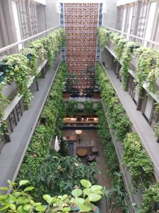
A Note About Green & Biophilic Design
Green, as we said, often evokes thoughts and feelings of nature. Biophilic design is a type of design based on the scientific hypothesis of biophilia, which suggests that humans possess an innate tendency to seek out connections with nature and life forms other than humans. Biophilic design uses this hypothesis to incorporate natural elements into the spaces we inhabit. The design theory can be applied to living rooms, bedrooms, and even office spaces and schools – wherever we spend our time. Adding biophilic design elements can also add a calming and soothing effect, much like the effect some people feel when spending time outdoors in nature. Adding in elements of green from indoor plants as well as other décor help connect your employees feel close to nature and this innate connection when they can’t be outside.
Blue
When it comes to blue, we’re hard pressed to find anything bad to say about it – it’s the only color discussed here that has an array of positive effects with little negative effect on the human psyche. Although it may evoke sadness for some, the myriad of positive feelings far outweigh the one. It is considered among the most calming of colors in the interior designer’s palette, with some of those calming effects including relaxation of the mind, heart rate, metabolism, blood pressure, and even hypertension. Aquatic, sky, and light blue shades offer a healing effect for the mind. When your employees are calm rather than on edge, they work more efficiently and productively.
Some other emotions associated with blue include control, bliss, softness, knowledge, power, intelligence, faith, trust, courage, and integrity. Blue is also representative of elegance, luxury, and prosperity – all things you want to see in your office environment.
The application of blue has no limits! Different shades can be used all around your office space. Use darker shades like royal blue as a primary color and mix in neutrals or other colors like yellow for kitchenettes and break rooms, employee relaxation areas, and more. Be sure to keep it light and airy in hallways and bathrooms.
Purple
When it comes to colors and what they symbolize, for many, the color purple is often associated with elegance and royalty. It also inspires creativity and design something any business wants to see from its employees. However, hue determines vibe: plum and violet add their brightness and flair to any design, while lighter shades like lavender and mauve produce a calm, regal effect.
Purple evokes emotions and feelings like elegance, luxury, richness, sophistication, drama, depth, and excitement, and even creativity or mystery. You can also hope to evoke calm, tranquility, and relaxation, depending on the shade you use.
Pink
Feeling feelings and concepts reflected by the color pink include cleanliness, functionality, sophistication, and glamour, many things you may want to see in the office. Sweetness, warmth, comfort, love, compassion, nurturing, and romance are other emotions evoked by the color pink that can be beneficial in the workplace. The more vibrant shades of pink, including magenta, fuchsia, and more, can be statement colors when paired with an anchoring shade like light blue.
Use complementary tones of vibrant red and neutral white for a sense of form and function. Since various shades may evoke feelings of compliance or loss of romantic attachments, as well as sweetness, adding in other colors can help minimize those extreme feelings.
Brown
Take everything in moderation, including the color brown. Use it in your office design as a way to reflect warmth and comfort. The natural and soft hues of brown relaxes the senses to the point that too much may actually lead to inactivity, lake of inspiration, and other negative effects you’d rather keep out of the office.
Instead, pair it with more vibrant shades and hues of other colors to create a feeling of resilience and security. Suggested pairings include yellow, white, red, green, and orange in order to eliminate gloom or less happy feelings in spaces where inhabitants should feel joy, calm, or excitement.
Brown is associated with a wide range of emotions, from negative ones including sadness, loneliness, depression, isolation, and indifference. It can also evoke positive feelings like safety, security, dependability, warmth, and comfort. Still more emotions connected to the color are determination, rigidity, strength, power and sophistication, and many more. Brown is a versatile color in your office color palette, but use it wisely.
Black
Simplicity, functionality, elegance. It’s a popular go-to for modern interior design and architecture, but is it right for a workplace? When you get down to the nitty-gritty psychological aspects of the color, designing an all-black palette can be overwhelming and gloomy. Break it up with white, or nearly any other color of the rainbow, to tone it down.
Some of the other emotions commonly associated with the color black are desire, protectiveness, elegance, modernism, sophistication, efficiency, control, and beauty – many of the elements you hope for in a productive, happy office environment. But be careful, black can also bring feelings of grimness, depression, and terror when used incorrectly.
Gray
Gray is a neutral, but evokes a wide array of emotions. As with many colors on this list, various hues as well as applications (where you use it in the office) can result in different responses. The color reflects form, functionality, and simplicity while also conveying style, elegance, and sophistication. It’s other positives include strength, power, rigidity, determination, and will power. Negative impressions include, much like black, depression and gloominess.
When used correctly, gray can be the ultimate neutralizer against bright and vibrant color schemes. While it may seem unobtrusive, avoid using light gray on walls and opt for a darker shade surrounded by the vibrancy of yellow, pink, white, and others for an uplifting mood. Another way to incorporate gray in your brighter spaces is through furnishings. The color adds elegance, sophistication, and a neutralizing presence to your office design.
Given the range of emotions associated with gray, it’s best to keep the color in textiles and accessories as opposed to walls and ceilings. Our best advice if you’re set on making it a focal color is to focus on bringing in natural light for a warm and welcoming appeal.
White
Just as with the other colors we have discussed, there are a number of shades of white. Ivory, eggshell, and an array of others are standards for walls and ceilings and are ready to be modified with other colors on walls and in textiles for a personalized look. It evokes feelings of tranquility, peace, harmony, cleanliness, and hygiene. When you surround employees with the color white, they are rarely disturbed by extremities and excitement and able to focus on the task at hand.
White reflects feelings of brightness and openness, giving a space a larger and cleaner look. On the psychological level, white’s calming powers help minimize feelings of claustrophobia, eases hypertension and anxiety, and regulates body functions like blood pressure and heart rate.
The list of feelings evoked by the color white seem endless. Openness, trust, fraternity, control, effectiveness, and functionality are some more. The “blank canvas” white offers also encourages creativity, challenge, productivity, and efficiency.
It’s the perfect color to use all throughout a space, increasing visual space and reducing tension at the same time. White looks great next to any other color and creates an unmatched vibrancy. For feelings of elegance, luxury, and prosperity, use white alongside gold, gray, and yellow. Add some vivaciousness to the office with bursts of red, orange, green, and others. For a calming and relaxing room, add blues and other muted tones.
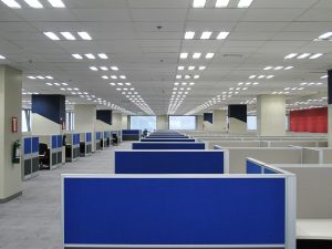
Natural & Artificial Light
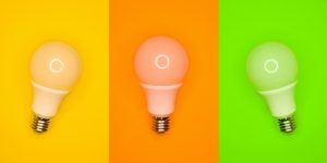
While the color of a room can have a great impact on the emotions of an inhabitant, so can the light source and quality of that light. Natural light is best of all, for its additional source of Vitamin D and other healing qualities. It also adds a unique finish to any color you may use. The glow of natural light sets various colors and tones off in a way no artificial light can duplicate – even those bulbs marked as a “sunlight” color intensity.

Artificial light has a separate and unique effect. It doesn’t bring the warmth and other benefits of natural light, and needs to be positioned in just the right way for it to have the effect you’re looking for. Overhead fixtures need to be chosen carefully, so their light can be cast in directions that fill the space in the same way sunlight does. Even lamps need to be chosen and positioned carefully for the light and color to have the desired impact.
Final Thoughts
There are dozens of shades of each color of the rainbow, each evoking a series of emotions that’s as individual to each inhabitant as a fingerprint.
The staff and designers at Realty Asset Advisors can help you create a workspace that’s efficient, functional, and colorful. We’ll help you choose a color palette that strikes a balance between company branding and colors that create the mood you hope to set for your employees in each space.
Contact us today!