Choosing paint colors for the office can be almost as fraught as choosing paint colors for your home. You’ll be spending a lot of time there – studies show we can spend up to 1/3 of our lives at work. That’s even longer if you’re the owner or high level management.
With all that time spent at the office, you want it to be a comfortable, welcoming place for you, your employees, and clients to be. You can achieve this with materials used, a homelike kitchen and break room, flooring, and even the paint on the walls.
There are several things you can do to choose the right colors for your corporate office environment.
Table of Contents
Branding
Low-VOC Paint
Finding the Best Colors
Color Psychology
Beyond Paint
Popular Colors and How They Affect the Environment
Red
Yellow
Blue
Orange
Green
The Color Green & Biophilic Design
Purple
Pink
Brown
Black
Gray
White
Natural & Artificial Light
Final Thoughts
Branding
Branding is the method that identifies companies and products to consumers and other businesses. It includes things like logos, colors, mascots, and anything else easily attributed to a specific brand. The Amazon “smile” doesn’t need the company name or the “A” and “Z” at the ends to be recognized and associated with the company. The Nike “swoosh” doesn’t need the company name next to it to be identified.
You can reflect your company brand in the paint colors you choose. Realty Asset Advisors has a primary color of red, meaning much of our branding – logo, letterhead, and more – feature red.
When you sit down with the staff of Realty Asset Advisors, we’ll talk about your company branding and how Customizing Space to Reflect Tenant Branding goes a long way to making your mark with consumers and competitors.
Low-VOC Paint
Choosing the type of paint is just as important as the color. If your renovation or build has focused on sustainable building practices, don’t neglect the opportunity to use low- or zero-VOC paints, or other environmentally-friendly paints. These paints reduce or eliminate VOCs, or volatile organic compounds. These chemicals have harmful effects on the environment, and can off-gas for years after that “new paint smell” has subsided.
Other alternatives include natural paints, recycled paints, and water-based paints. Natural paints are made from natural materials like plant oils, water, chalk, and clay, while recycled paint is paint that has been collected, processed, and repurposed into new paint. Water-based paints use water as the primary solvent, cutting down on VOCs.
Read more about the impact of sustainable paints on indoor air quality in this blog post from our sister company, Structr Group.
Finding the Best Colors
You may think the best colors for your interior are your company colors. The best place for those colors, however, is your entrance and signage. The red and black of Realty Asset Advisors are not colors that should be present in many areas of an office. Neither is the maroon and gold of ASU. These colors have their place, typically in client-facing spaces where you want people to remember you and your company. When finding the best colors for the interior of the rest of the office, analyzing what makes people tick, and how they perform in certain environments (and around certain colors!) will help you choose more appropriate colors for other areas of your corporate interior.
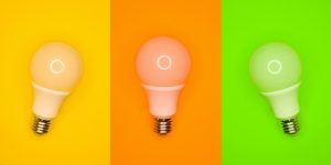
Color Psychology
There’s a subconscious reason your favorite color is purple, blue, pink, yellow, or any other color. Color psychology is a theory of how individual colors affect cognitive function, creativity, mood, productivity, and more – all things you want people performing at their best at during work hours.
Greens and blues are calming hues that evoke relaxation and peace. On the other side of the spectrum, the vibrant tones of orange, red, and others evoke feelings of energy and passion. Neutrals like gray and white also provide a sense of serenity.
Color psychology is based on the scientific effect of color and its many hues on the human brain. Studies have shown that although the effects of colors may have a general similarity for everyone, individuals have unique responses to ‘standard’ color schemes.
Beyond Paint
Our focus for this article is paint, but color psychology reaches beyond the paint on the walls to things like furniture fabrics, lighting, flooring and more.
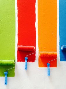
Popular Colors and How They Affect the Environment
Red, blue, and yellow are the primary colors and orange, green, and purple are the secondary colors we all learned about in preschool and kindergarten. These and their many shades, paired with neutrals like black, gray, and white create a color palette with an unlimited amount of colors and hues to choose from.
When you sit down to choose your colors, keep some of these details about each in mind:
Red
Proceed with caution! This primary color evokes a range of different feelings. Positive emotions for the workplace like energy, vigor, strength, courage, and leadership clash with feelings of anger, rage, malice, wrath, and even danger and war!
While the feelings of joy, love, passion, sensitivity, desire, and sexuality are positive, you may not want to attract such feelings to the office where romance may inadvertently sabotage productivity.
To stay on the safe side, pair red with neutrals like white or beige for the calming effect you desire.

Yellow
Let the yellow of the sun into the office with some yellow paint. This color brings light and happiness to the office resulting in heightened intelligence, productivity, cordiality, energy, and fitness. It also radiates the effects of biophilia, as it’s something that makes people feel closer to nature (the natural light of the sun). Care, happiness, joy, and obedience are also key positive qualities in employees, making using splashes of yellow a top pick for some areas of the office like the kitchenette/break room, or smaller spaces like hallways or the bathroom.
Hold off on using too much yellow, or yellow’s duller and darker shades that may create feelings of jealousy, doom, decay, sickness, or caution. These shades have been associated with uncontrollable emotions, high blood pressure, and stimulating temper without provocation.
Like red, it may be wise to limit yellow to necessities like company branding, and pair it with neutrals for balance.
Blue
Out of all the colors on this list, you might call blue and its shades the “perfect” color for your corporate office interior. In fact, we’re hard-pressed to find anything bad to say about it! If we must give one reason, blue is sometimes associated with sadness.
Blue is considered one of the most calming colors, triggering feelings of relaxation and in turn calming the mind, heart rate, metabolism, and even blood pressure and hypertension. Consider aquatic, sky, and light blue shades for employees who are less on edge – they’ll work more efficiently and productively! Emotions triggered by the color blue include bliss, control, courage, faith, integrity, intelligence, knowledge, power, trust, and softness. Additionally, blue often represents elegance, luxury, and prosperity – all must-have features of a corporate office environment.
Where should you use blue? Anywhere! Everywhere! Darker shades including royal blue can be used all around the office paired with neutrals and other colors like yellow in the kitchenette/break room. For smaller spaces like bathrooms and hallways, stick to lighter, more airy shades.
Orange
Like yellow, the vibrancy of orange comes with an array of positive emotions as a reflection of sunshine and nature. Employees may be filled with the positive emotions of happiness, joy, calm, relaxation, and warmth. Paired with other positive attributes like creativity, fascination, healing, energy, and adventure, your team will be up for any job or task with a bit of orange around!

Be careful! Similar to red, it has positive emotions that may or may not be appropriate in an office environment like love, passion, attraction, sexuality, desire, pleasure, and attachment. Orange has negative side effects as well: aggression, betrayal, deceit, distrust, and dominance are negative emotions you don’t want plaguing a group of colleagues who need to work together. Remind yourself and your employees of your biggest goal: prosperity, and choose gold to bring in the wealth and prosperity you hope to achieve.
You may be wondering where and how to use this controversial color. For the biggest impact, splash it around the kitchenette or break room, but make sure it’s the “pop of color” against neutrals rather than the primary focus.
Green
With its link to nature, green brings feelings of freshness, peace, and trust. A variety of shades are associated with food and the comfort it can bring. Like blue, it relaxes the senses, lowering hypertension and blood pressure. Adding green evokes feelings of harmony, fertility, growth, safety, calmness, protection, comfort, and serenity – attributes you need in a productive and efficient workplace.
Take care when choosing a shade. Darker greens can spur negative emotions like greed, jealousy, sickness, conflict, and cowardice. Lighter and aqua shades offer more serenity. “In between” shades, like olive green, are considered a symbol of worldwide peace and harmony.
To properly use green around the workplace, vary the shades throughout. Choose lighter paint colors and save the dark for accessories and greenery.
The Color Green & Biophilic Design
Biophilic design operates on the hypothesis of biophilia, a hypothesis that suggested humans possess an innate tendency to seek out connections with nature and life forms other than humans.

Green is a big part of nature, and the use of it throughout indoor environments often evokes thoughts and feelings of that connection to nature. Darker shades of green on the walls emulates the natural environment when employees don’t have access to outdoor environments. As previously stated, however, you may want to save the dark shades for office plants rather than paint.
Purple
Elegance, royalty, luxury, richness, sophistication, creativity, calm, relaxation, tranquility, drama, depth, excitement. The list of positive attributes of purple seem endless. Keep in mind that hue determines overall vibe. Shades of plum and violet add an exciting brightness and flair in contrast to lighter shades like lavender and mauve, which produce a clam, regal feeling.
Pink
Pink may not be the first color that comes to mind when preparing to paint, but pink brings with some very positive and beneficial emotions. Cleanliness, functionality, sophistication and glamour can set a positive tone wherever you use the color. Sweetness, comfort, warmth, love, compassion, nurturing, and romance are more positive vibes to spread through the office.
The sadder side of pink evokes feelings of compliance, loss of romantic attachments or sweetness, leading to less productivity or losing focus on the job. Pink isn’t just soft and lovely, it comes in more vibrant shades like magenta, fuchsia, and others and can be a bold statement color against blues and neutrals.
Brown
If there’s one color we can tell you to use in moderation, it’s brown. It can be used in its softer hues to relax, but almost to the point of inactivity, lack of inspiration, and other slowing, negative effects on creativity, productivity, and efficiency you’d rather not have in the office.
To mitigate those effects, pop in happier colors like yellow, white, orange, red, or green for added joy, excitement, or positive calm. You’ll combat the negative emotions of sadness, loneliness, depression, isolation, and indifference in exchange for safety, security, warmth, comfort, and dependability. When used sparingly and wisely, this versatile color can also spark determination, strength, power, rigidity, sophistication, and more.
Black
Form, function, elegance. This go-to color for modern interior design and architecture may not be right for the walls of your workplace. Black can be overwhelming and gloomy, so pair it with a neutral or just about any other color or hue you can imagine to tone it down.

When used properly, positive emotions sparked by the color black are desire, elegance, protectiveness, modernism, efficiency, sophistication, control, and beauty. Take care with black in order to avoid the grimness, terror, and depression it can evoke.
Gray
Gray is a neutral, but it sparks a wide array of emotions that are anything but. Like many other neutrals it reflects form, functionality, and simplicity while conveying elegance, style, and sophistication. The positive attributes of gray you want around the office include strength, rigidity, power, determination, and will power. Proceed with caution. When used incorrectly, gray can evoke depression and gloominess. When it comes to paint on the walls, opt for lighter hues. Ideally, gray should be an accent color and be reserved for textiles and accessories.
White
Every office or retail space starts with a “white shell” – an empty space of white walls which you can paint however you please. White has a variety of shades – ivory, eggshell, and more – which are standard for walls and ceilings. It’s the other color on this list where we’re hard pressed to find anything negative to say.
You can choose to keep the white, using colors in textiles rather than paint, but you may miss out on the benefits of having white on a larger scale. It evokes positive feelings of peace, harmony, tranquility, cleanliness, and hygiene. White rarely disturbs employees and allows them to focus on the task at hand, increasing productivity and efficiency.
White offers brightness and openness and makes spaces feel larger and cleaner. It’s perfect for smaller offices that need to take advantage of every inch to create the illusion and feel of more space. White helps minimize feelings of claustrophobia, regulated body functions including blood pressure and heart rate, and eases disorders like hypertension and anxiety. Positive feelings include control, openness, trust, fraternity, effectiveness, functionality and more! The “blank canvas” that wife offers encourages positive attributes like creativity, challenge, efficiency, and productivity. White goes with any color you can think of!
How do you use white as a paint color? However you want! Use it as a backdrop for any other color to create a canvas that reflects luxury, prosperity, elegance, vivaciousness, or a calm and relaxing environment.
Natural & Artificial Light
You can’t talk about color without talking about light. The colors you surround yourself with have a great impact on emotions, but so does the light source and quality of the light. Light source can also help with choosing colors – what colors look good under the light you have to work with?

Natural light is always best. It brings out the right tones and natural finish of paint colors while offering its additional source of Vitamin D and other healing qualities. No artificial lighting can duplicate the sun’s rays.
Artificial light is often necessary but has its own separate and unique effect. While there is not warmth or health benefits associated with natural lighting, the proper positioning can simulate the sunlight you can’t capture naturally, as well as produce any other effects you hope for. Choose overhead fixtures carefully, selecting those that cast their light in directions that fill the space the way sunlight can to show off your great color scheme.
Final Thoughts
Choosing the paint for your office is more than just looking at a color palette and choosing your favorite color, or just sticking with corporate logo colors. Utilizing color psychology to choose the optimal colors for the office environment you want to create is an important step in the process.
When you sit down with the staff at Realty Asset Advisors, we’ll help you decide on colors that are on-brand and harmonize with the environment you want to create.
Contact us today!